The Decade We Spent Arranging Components
Let me start with a confession — one you have probably made to yourself too.
Take the last ten years of your portfolio. Strip out the logos and the colour. Lay the screens side by side. A stranger would struggle to tell the projects apart.
A navigation rail on the left. A header with a search field and an avatar. A table, or a grid of cards. A filter bar. A detail panel that slides in from the right. A modal to confirm the destructive thing.
You have built this, in some arrangement, more times than you would like to count. So have the rest of us.
This is not a criticism of your taste. It is simply a description of what the work has been. For most of the last decade, product design has honestly been the craft of arranging a known set of components to expose a known set of data and actions — as clearly and pleasantly as possible.
And we got genuinely good at it. We learned spacing, hierarchy, and the small kindnesses of a well-written empty state. We turned chaos into order, again and again, for product after product.
But somewhere in there, many of us began to feel a quiet flatness we rarely say out loud.
Not burnout exactly. More like a suspicion — that we had become very skilled at a problem that was mostly solved, and that the next project would just be the same components, rearranged, with a different brand on top.
Here is my argument: that flatness was real. Its cause is about to disappear. And what replaces it is the most interesting thing to happen to design in a long time — but only for the people who see what is actually changing.
Why Everything Started to Look the Same
The convergence was not laziness. It was logic.
Once an interaction pattern is solved well enough — once the data table with its sort, filter, and pagination becomes a “known good” — there is little reward for reinventing it and real risk in trying.
- Users have already learned it.
- Component libraries encode it.
- Design systems enforce it.
So the rational move, ninety percent of the time, is to reach for the established pattern and spend your creativity on the brand surface. Multiply that rational move across an entire industry for a decade, and you get convergence: a global house style of rounded cards and soft shadows that everyone arrived at independently, because it works.
Then the generative AI tools arrived and did something clarifying. They took that convergence to its logical end.
Ask a capable model to “design a dashboard” today, and you get something competent in seconds — the right cards, sane spacing, an indigo accent, a responsive grid. It is fine. It is also instantly recognisable as the median of everything that came before it — because the median is exactly what a model trained on the last decade produces.
Scroll any “I redesigned this with AI” thread and you will see the same interface posted a dozen times by a dozen people who have never met.
Here is the part worth sitting with:
The thing the machine can now do for free is the thing many of us spent a decade getting good at.
Arranging known components into clean, conventional screens is no longer scarce. And when average becomes free, average stops being valuable.
The work that stays valuable is the work the median cannot reach: knowing which pattern is worth using, when to break it, and what the interface should do in the situations no template has a default for.
That is not a downgrade of the profession. It is a removal of its floor. The repetitive part is leaving. The real question is — what were you standing on besides it?
The Assumption That Is Breaking
To see where the genuinely new work is, you have to notice an assumption so old it is almost invisible.
Nearly every interface you have ever designed assumes that the user knows what they want, knows where to find it, and knows what to do when they arrive.
Think about it:
- A menu assumes you can name the thing.
- A search box assumes you can describe it.
- A form assumes you know which fields matter.
- A dashboard assumes you can look at twelve numbers and decide, yourself, which one should change your afternoon.
The interface presents the options; the human supplies the judgement about which option, when, and why. For forty years, the burden of knowing has sat squarely on the user — and our job was just to make that burden as light and legible as possible.
Intelligent systems break this assumption. And they break it in three directions at once — which is exactly why this is hard, not merely new.
1. Sometimes the old assumption still holds perfectly
The user knows exactly what they want: open last month’s report, export it, send it.
For this, nothing about intelligence improves the experience. They should navigate to the thing, reliably, identically every time. Predictability is the whole value here — and a system that got clever would only make it worse.
2. Sometimes the user does not know what they want
They know only the outcome they need.
They do not want to learn which view reveals that something is going wrong — they want to be told that it is, and what to do about it. Navigation is the wrong model here. Asking someone to go find a problem assumes they already suspect it. The valuable thing is a system that surfaces the right fact before anyone went looking.
3. Sometimes the system knows something the user does not
A pattern across data that no human could hold in their head at once.
The honest response is not to wait in a menu to be asked. It is to speak first. But speaking first spends trust — and a system that interrupts too often trains people to ignore it.
Here is the catch. Designing for any one of these is tractable. Designing a single, coherent product that moves between all three — without the user losing their footing — is the new problem.
It does not look like arranging components. It looks like deciding, moment to moment, who is in charge of knowing.
What Design Actually Becomes
If the machine now handles the median screen, and the live problem is the relationship between a person and a system that can act, then the centre of gravity of our craft moves.
It shifts from arranging what is on the screen to designing things we never used to call “design” at all.
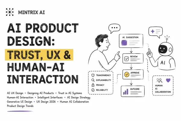
You begin designing trust as a first-class material. When a system proposes an action — how does the person see exactly what will happen before it happens? How do they undo it after? What does the system show about why it recommended this — available the instant they wonder, invisible when they do not? Trust is not a copy tweak or a reassuring colour. It is an architecture, and someone has to design it.
You begin designing intent — the messy space between what a person types or says and what they actually mean. How much should the system infer? How much should it confirm before doing anything consequential? Where is the line between a system that feels responsive and one that feels presumptuous?
You begin designing the relationship between human and machine judgement — when the system leads and when it waits, how it earns the right to interrupt, how it hands a decision back, how it stays quiet enough that people still listen when it finally speaks. This is closer to choreography than to layout.
The designers who will define the next decade are not, I think, the ones with the most refined visual systems — valuable as those remain. They are the ones who can design trust, intent, and the collaboration between people and intelligence — and who understand that a beautiful interface which quietly removes a person’s agency is a failure dressed up as a success.
The NN/g crowd is right that trust is the core problem of this era. What they say less often is that trust is designable — and that almost no one has been trained to design it, because until very recently, nothing on the screen could act on its own.
The Hardest Possible Classroom
When these ideas get exciting, there is a temptation to test them somewhere forgiving — among expert users who tolerate complexity, read the docs, and forgive a rough edge because the power is worth it.
Most products we admire for their interaction models live in that gentle climate. It is a lovely place to design — and a poor place to learn whether your ideas are actually true.
Education is the opposite climate. Which is exactly what makes it honest.
Picture the actual people:
- A principal who has run a school for twenty years on relationships and instinct, who judges software by one question: did this make my morning calmer or more frantic?
- A teacher with six minutes between classes and zero patience for a tool that asks more than it gives.
- A parent who will only ever touch the system through whatever messaging app is already on their phone — who never agreed to learn an interface and never will.
None of them are power users. None will read a tutorial. None will tolerate being made to feel stupid. And all of them operate inside an institution where the stakes are real children, real money, and real legal obligations — a setting with almost no tolerance for a confident, wrong machine.
Every escape hatch we normally rely on is sealed here:
- You cannot say “our users are technical.”
- You cannot lean on the user to supply the missing judgement.
- If the system speaks first, it must be right and brief.
- If it interprets intent, it must confirm before touching a child’s record.
- If it acts, every step must be visible and reversible — because the person approving it is doing so between a parent meeting and a fire drill.
A design that earns a tired principal’s trust at six in the morning has solved something real. A design that merely demos well has not.
This is the climate we have chosen to work in at Mintrix. Not because education is easy ground for these ideas, but because it is the hardest — and hard ground is where you find out whether an idea was true or just elegant.
We are trying to build a product that stays reliable where it must, notices what a person would miss, and answers when spoken to — for users who will never meet it halfway. We do not have the whole answer. What we have is a strong point of view and a refusal to dilute it into yet another dashboard.
The Question We Keep Returning To
If software is becoming capable of acting on its own, what exactly is the role of design?
- Is it arranging components? That part is leaving — and good riddance to the repetition.
- Is it designing screens? Increasingly the screen is not fixed; it is assembled in response to what the system knows and what the person wants.
- Is it choosing what should exist in the interface at any given moment — and what should stay hidden until it earns its place?
Or is it something we do not yet have a clean word for:
The design of the relationship between a person and an intelligence — such that the person ends up more capable, and more in control, than they were before.
We do not think the field has settled this. We are fairly sure it is the most interesting question on the table — and that the people who find it interesting are exactly the people we are hoping to find.
If that is you, and any of this felt less like an article and more like a description of your own week, we would like to talk.
Quick Answers (FAQ)
Why does so much software look the same? Because convergence was logical, not lazy. Once an interaction pattern like the data table is solved, users learn it, component libraries encode it, and design systems enforce it. The rational move is to reuse the pattern and spend creativity on branding — and across a whole industry over a decade, that produces a single global house style.
Is AI replacing product designers? No — but it removes the floor. Generative tools can now produce the “median” dashboard for free. What stays valuable is the work the median cannot reach: knowing which pattern to use, when to break it, and what to do in situations no template covers.
What does it mean to “design trust”? Designing trust means building the architecture that lets a person see exactly what a system will do before it acts, undo it afterwards, and understand why it recommended something. It is not a colour or a copy tweak — it is a structural design problem.
Why is designing for education so hard? Because the users — principals, teachers, parents — are non-technical, time-poor, and operate where the stakes are children, money, and legal compliance. There is no room for a confident, wrong machine, so every assumption a system makes must be right, brief, and reversible.